about
Flutterwave
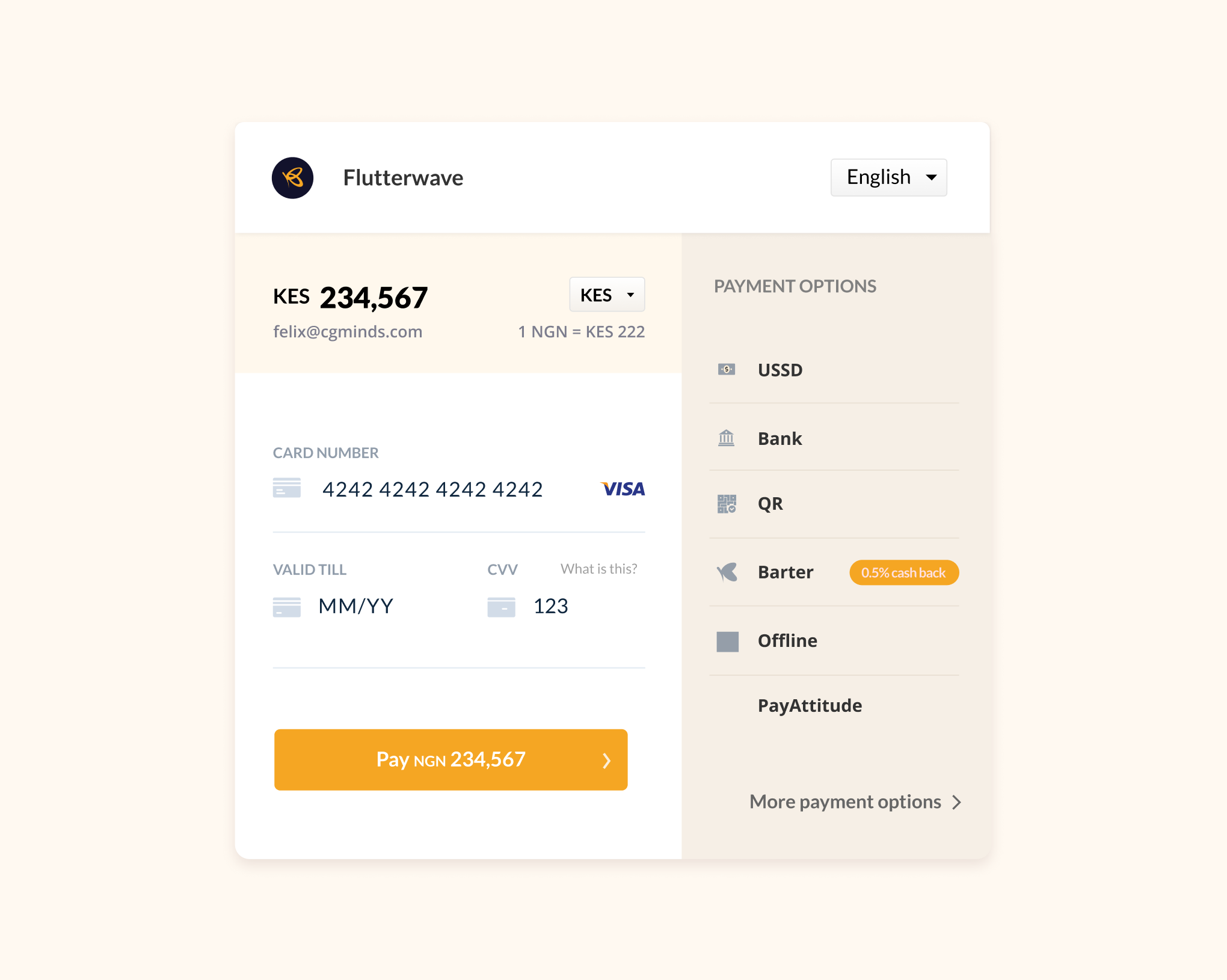
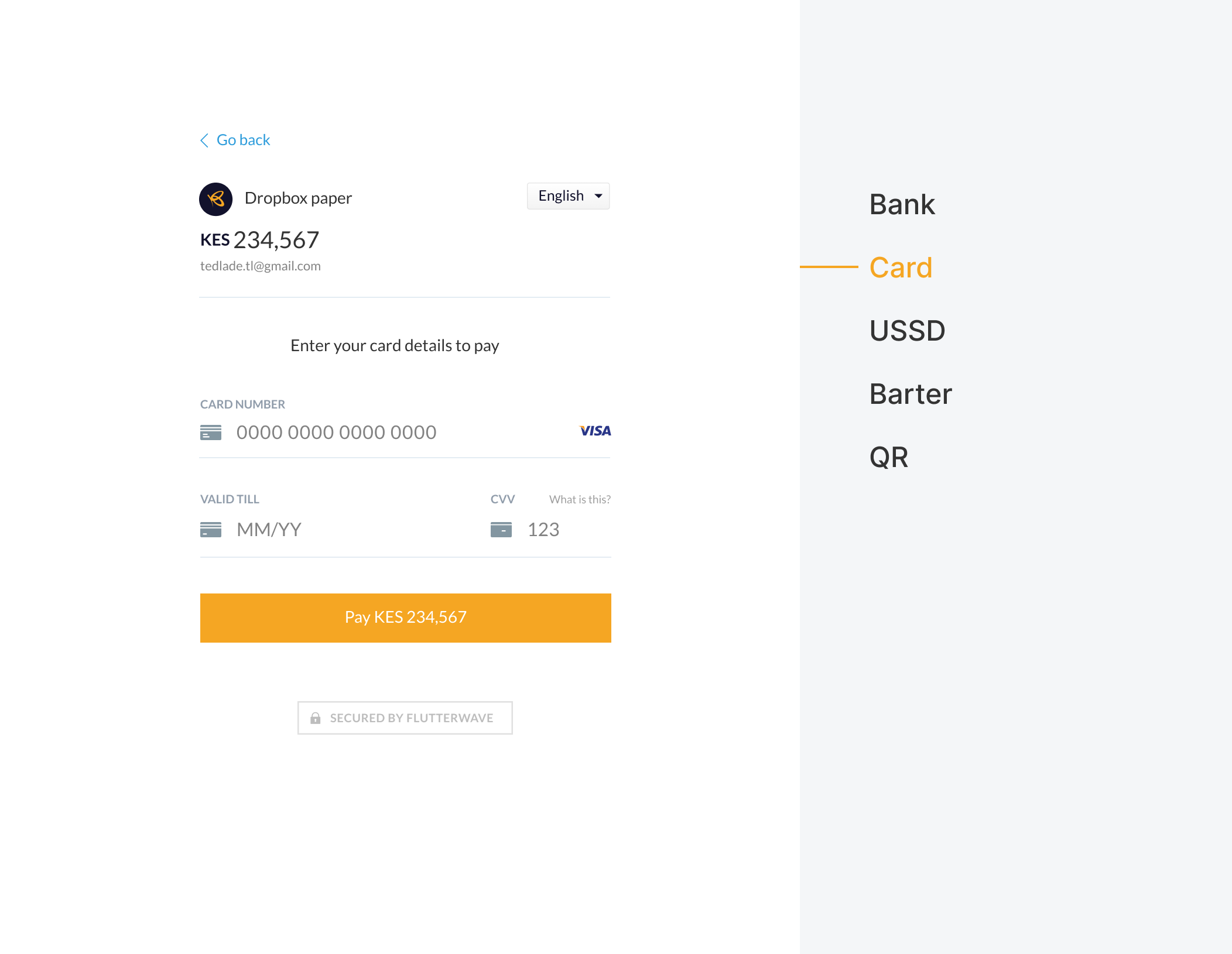
Flutterwave provides one of the easiest and most reliable payment solutions for businesses and customers in Africa. Making it possible for customers within and outside Africa to pay businesses anywhere around the world using their preferred payment options.
The Flutterwave checkout was one of the first products of the company that has just one job, make it possible for customers to pay businesses seamlessly. In 2020, the Flutterwave checkout processed over $4billion in transactions.
For most customers, the Checkout is the first(and sometimes the only) Flutterwave product they get to interact with. Which means that it doesn’t just have to work, the experience has to be seamless.
the project
Our goal was to provide an exceptional and seamless payment experience for our customers, no matter the device they chose to use. We pushed to deliver fast, secure, and user-friendly solutions that made transactions effortless and pain-free.
why a new checkout?
- Scalability and Speed
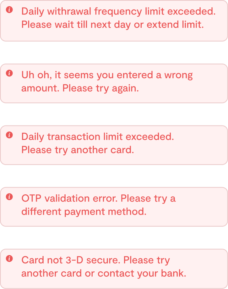
- Better way of communicating errors
- Improve payment method flows

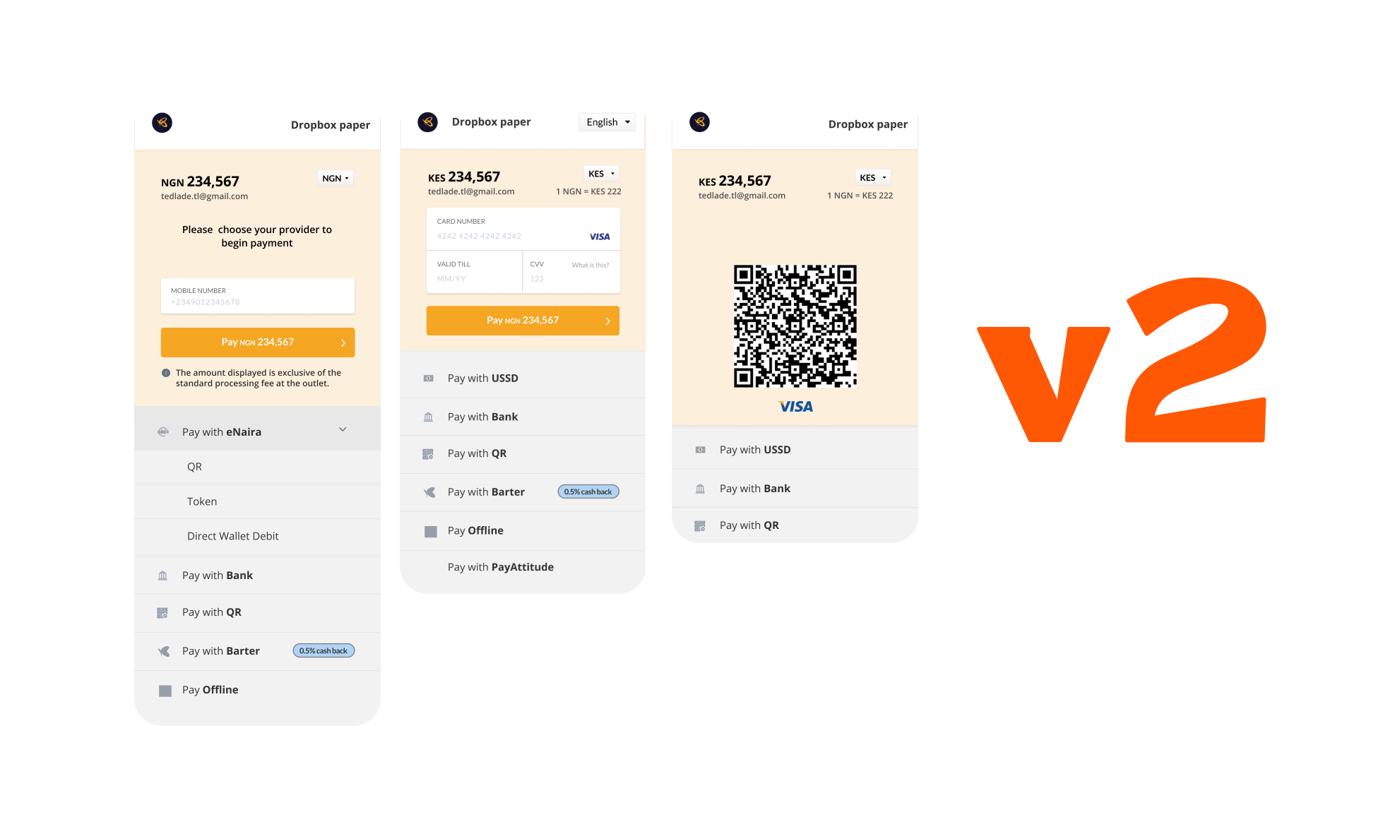
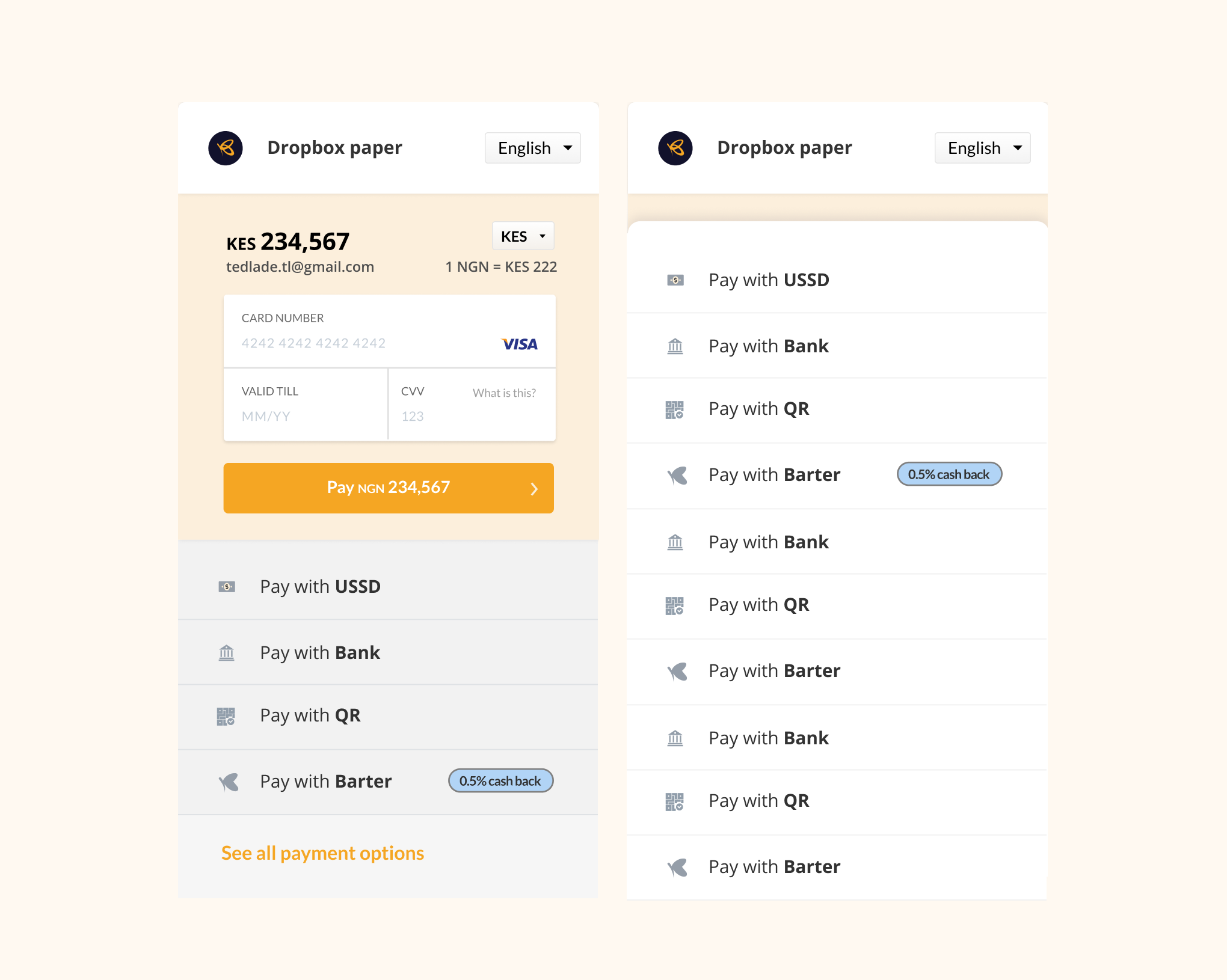
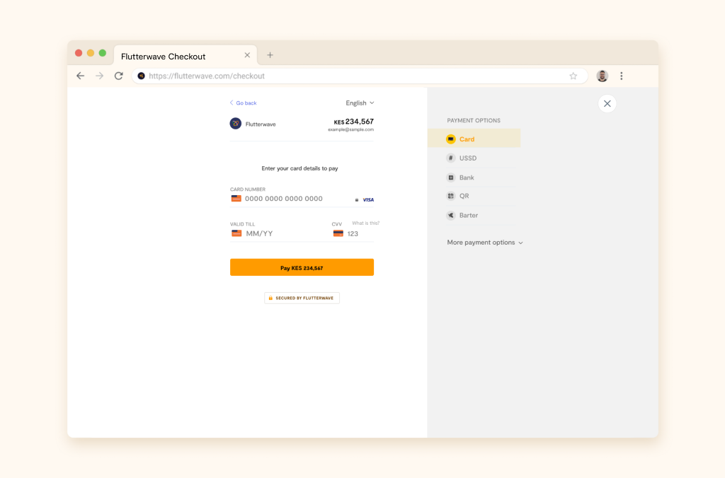
With just 5 payment options, the V2 was perfect. But, as the list grew(to 18 currently), it became harder and took more time to load the checkout and a bit difficult for users to find a payment method especially if it’s the last on the list.
better errors messages
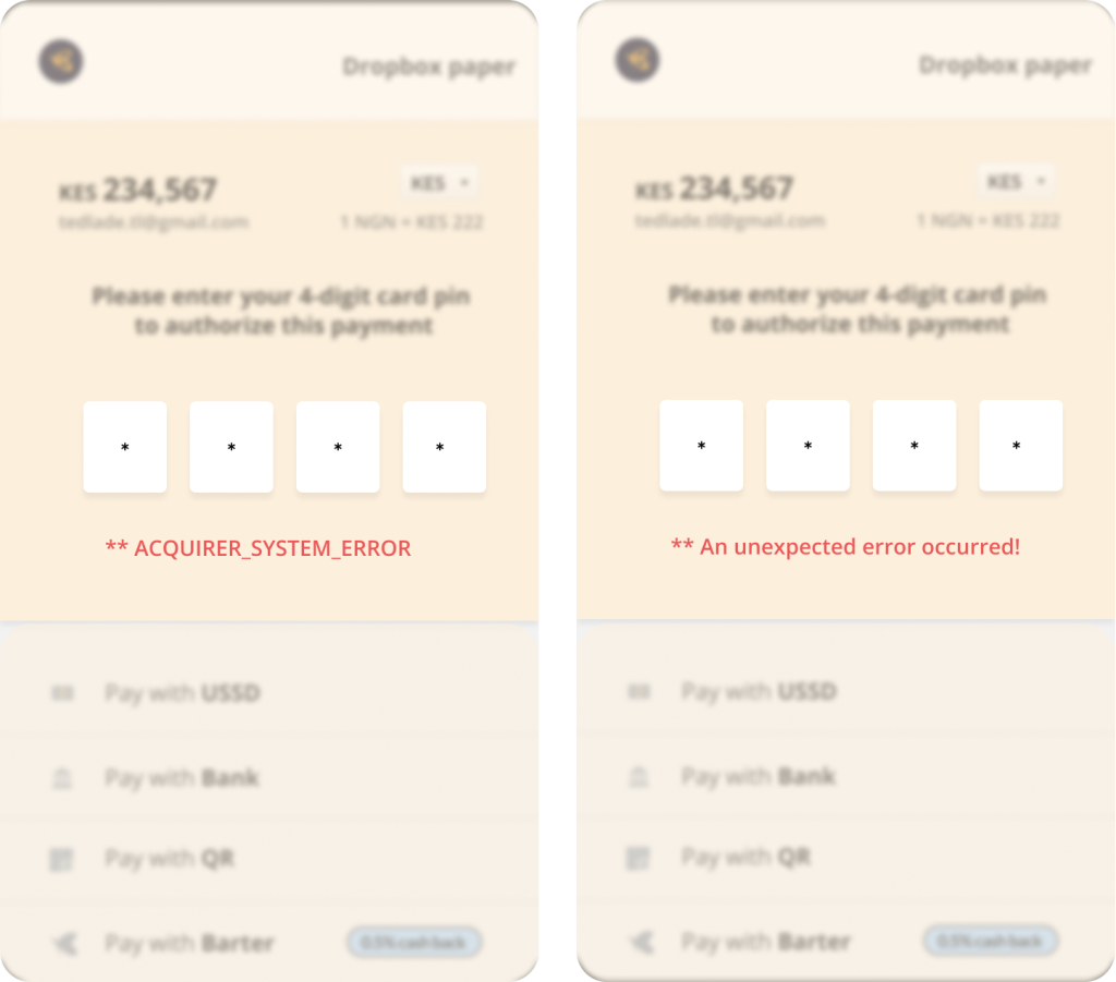
On the V2, error messages were vague and most of the time, left customers with more questions than answers. Customers were usually left to either abandon the transaction or contact the customer experience team to resolve or help them figure out how to proceed with the transaction.
improve payment flows
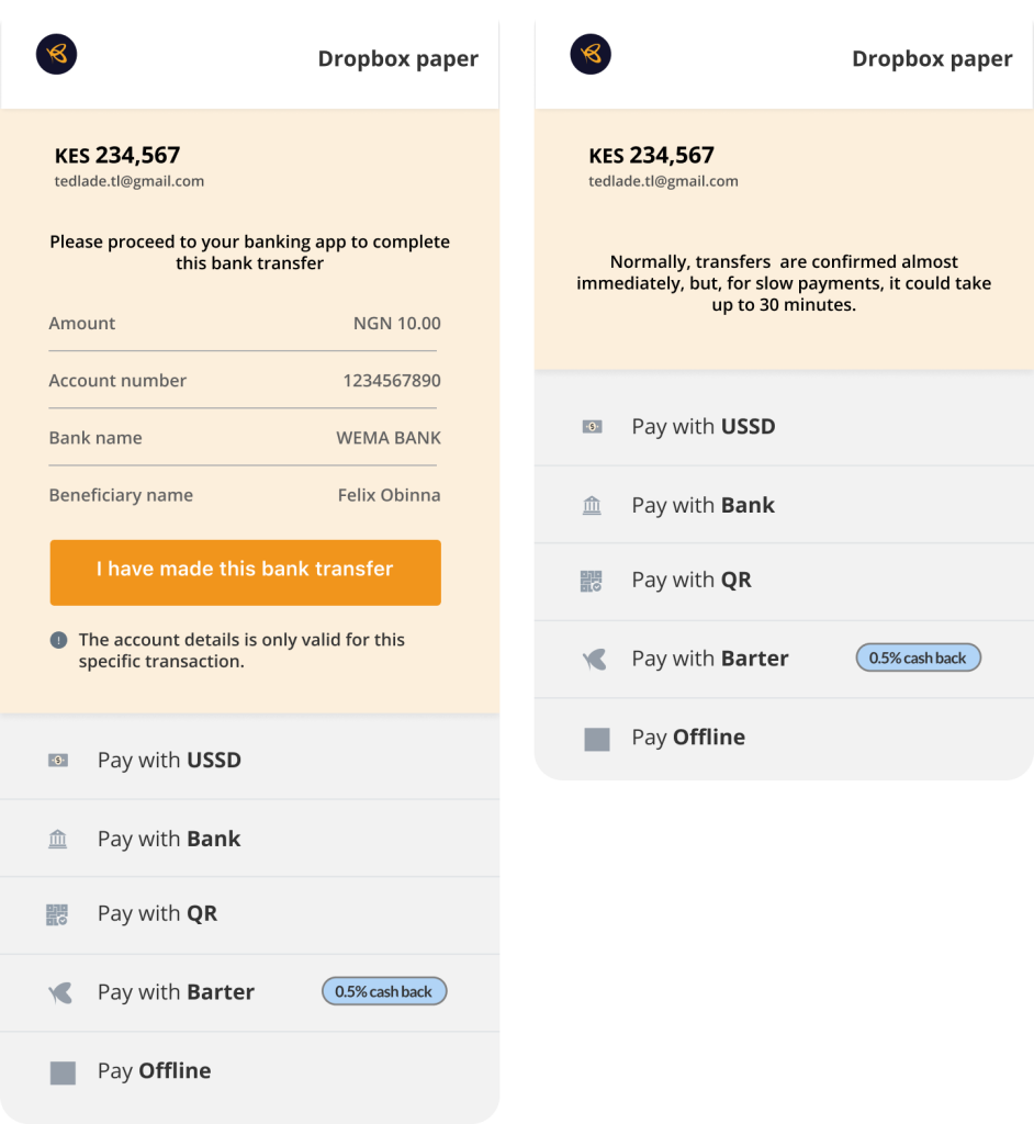
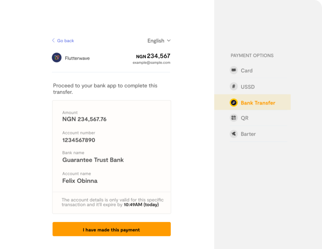
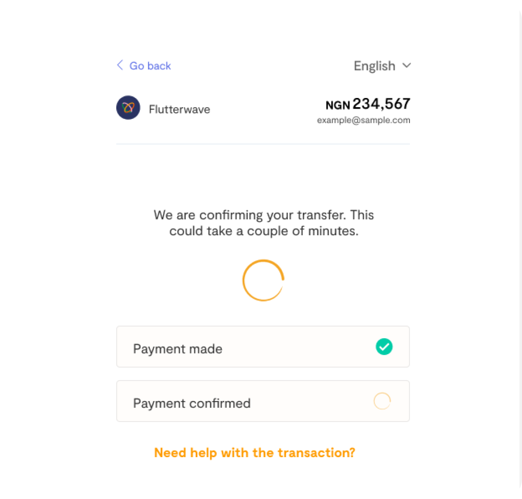
Bank transfers in Nigeria is usually instant. But there are times when it take a couple of minutes to hours to reflect. And other times, it fails and the money is reversed.
The V2 did a poor job of managing customers’ expectations and didn’t communicate what happens if after the shown time elapses and the payment was not confirmed.
data analysis and market research
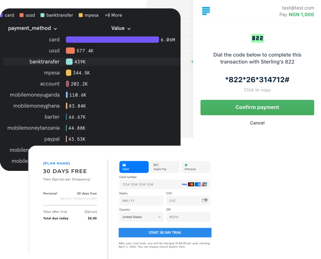
I monitored the product performance(revenue and interaction)of the V2 product to better understand the lapses and the areas that needed improvements, and shared the report with the team.
I set up a weekly meet with the CX team to review customer concerns, complaints, and frustrations when making payments on the checkout.
Researched, tested, and reviewed checkout products by other major players.
iterations
I started off with rough sketches and transitioned to screen design.
We had weekly sessions to test, gather feedback, and iterate.
final piece
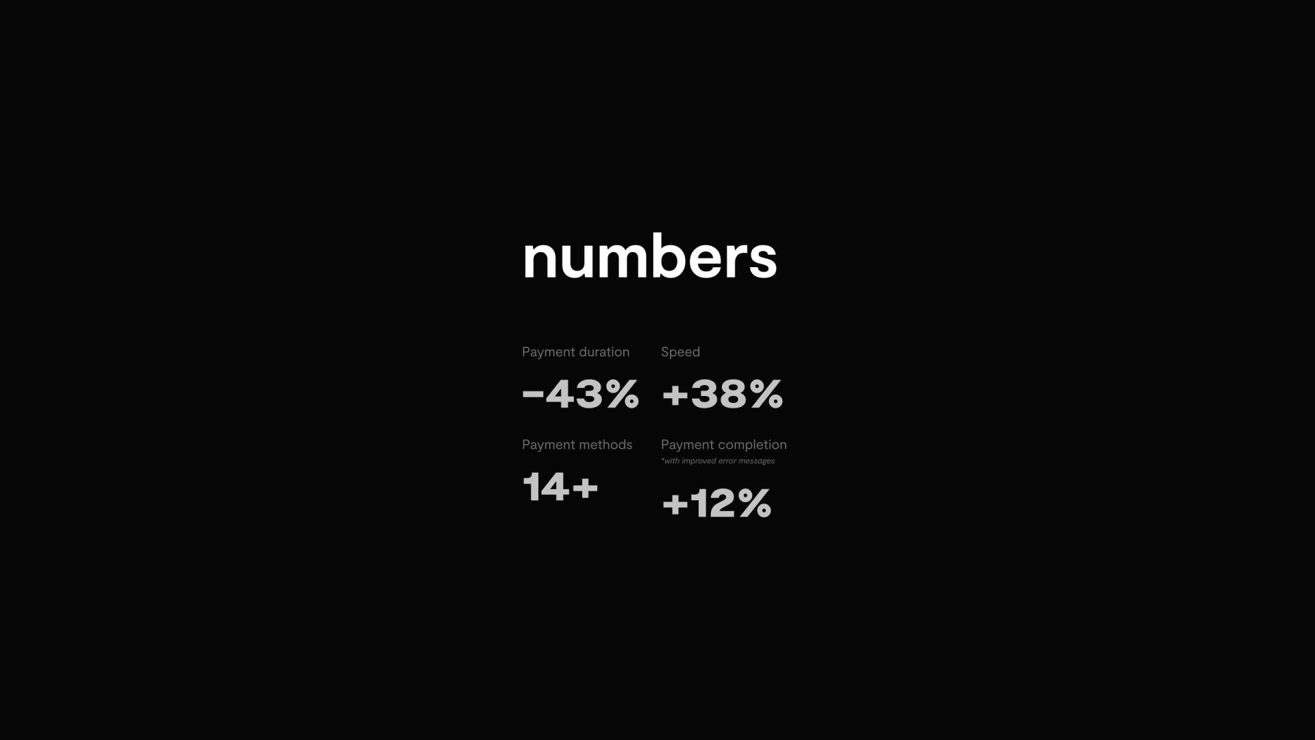
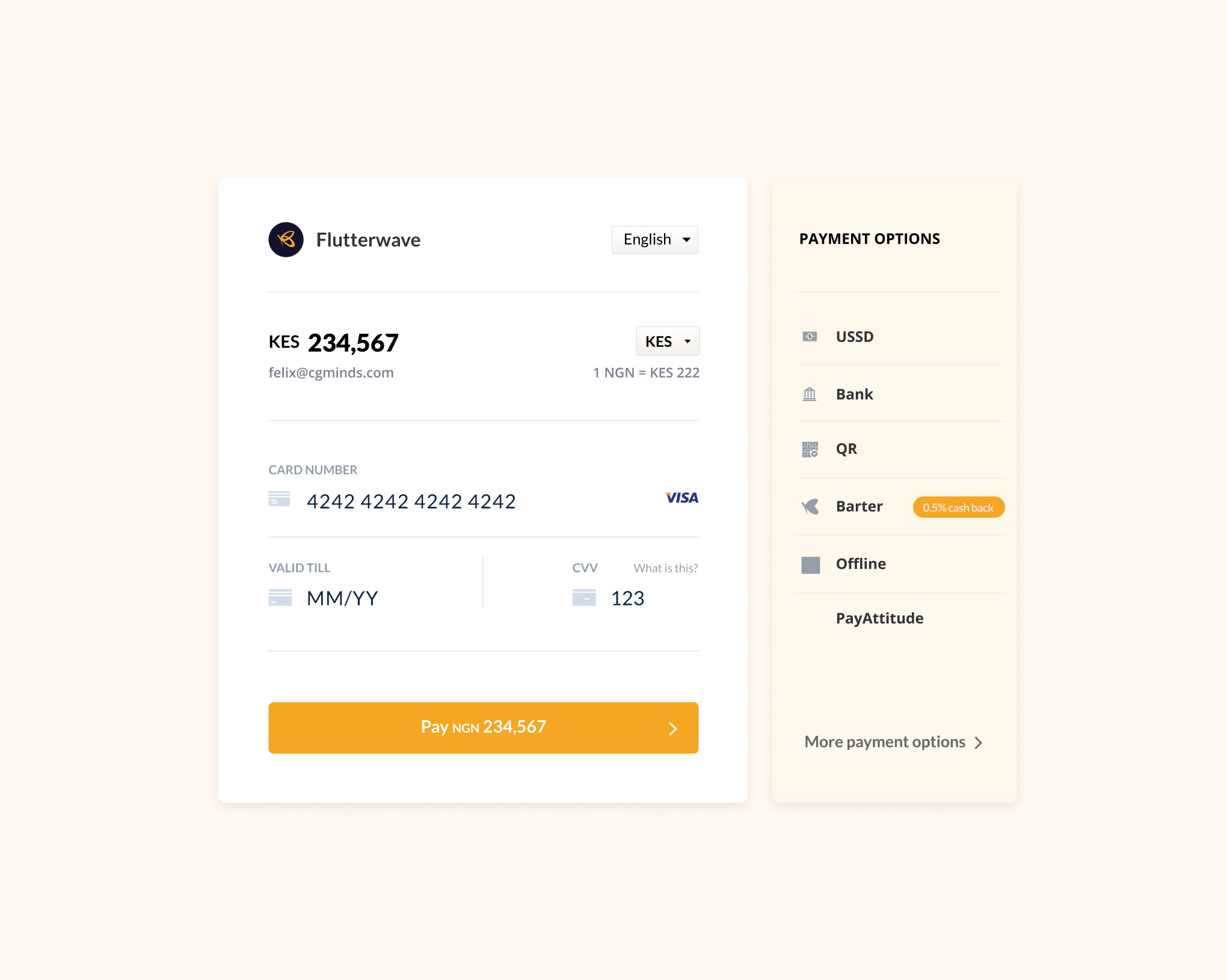
The final design was a result of thorough research, collaboration, and iteration, aligning seamlessly with user needs and business goals. It featured a streamlined interface, clear navigation, and intuitive workflows, ensuring a consistent and engaging user experience across all touchpoints. This approved solution not only addressed key pain points but also exceeded usability standards, setting the foundation for measurable success post-launch..
why right sidebar?
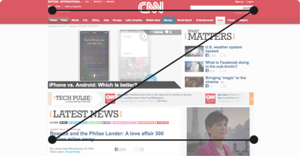
There are two key patterns that web contents are consumed in; the Z-pattern and the F-pattern. The Z-pattern shows the route the human eyes follow when scanning contents on a web page; left to right, top to bottom.
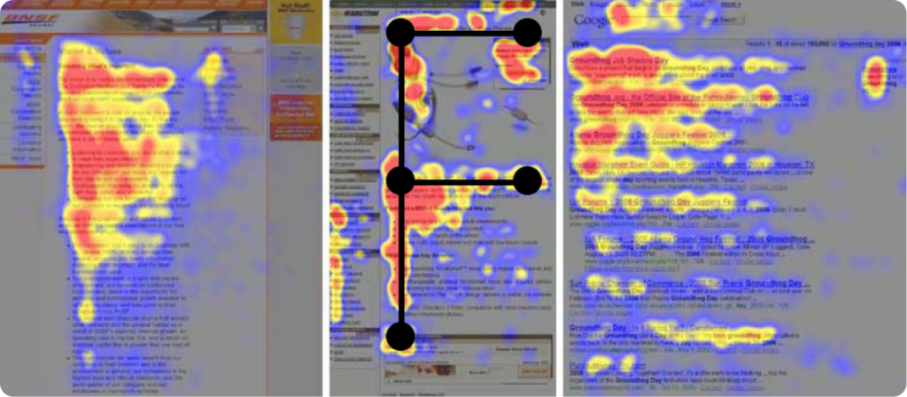
NNGroup conducted eye-tracking visualizations on different types of web pages: an about page, product pages, e-Commerce websites, and search results pages.
The result of the research birthed the F-pattern which is currently the most used and widely adopted content pattern for web contents.
designs
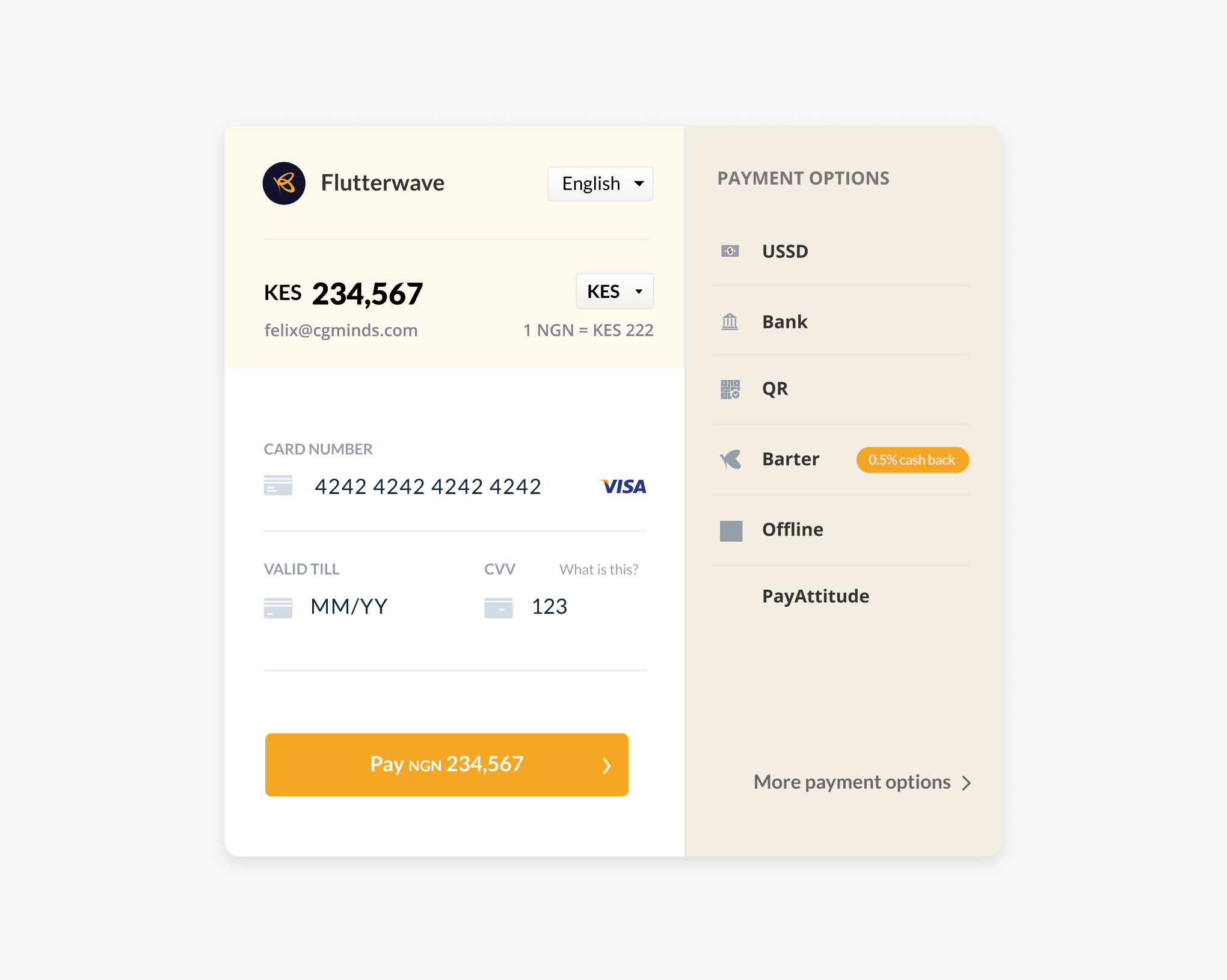
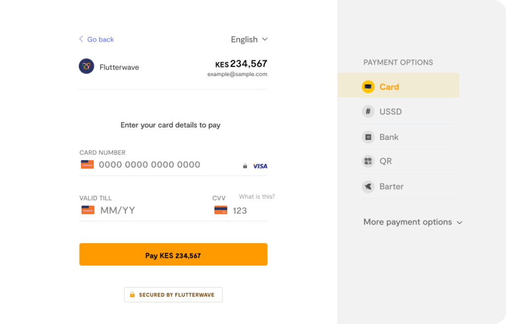
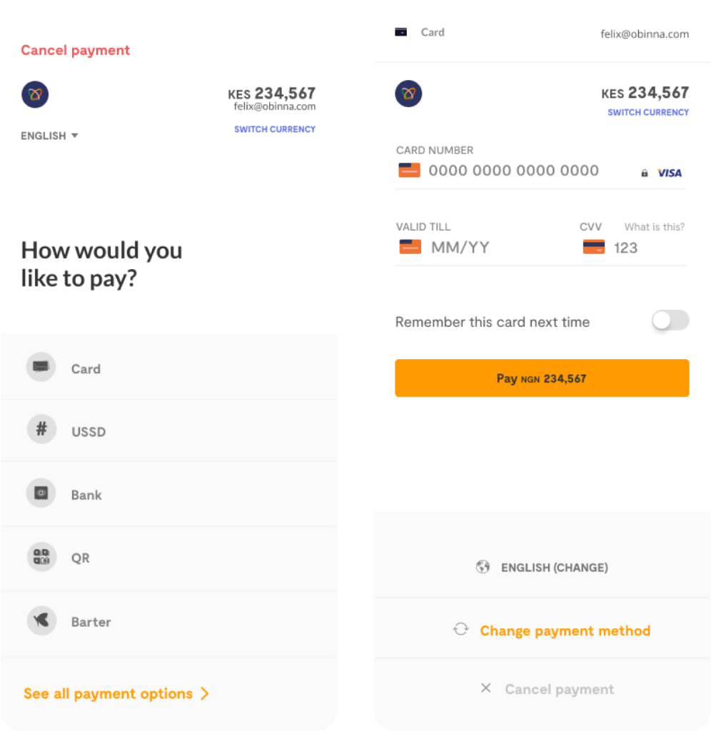
card payment
bank transfer
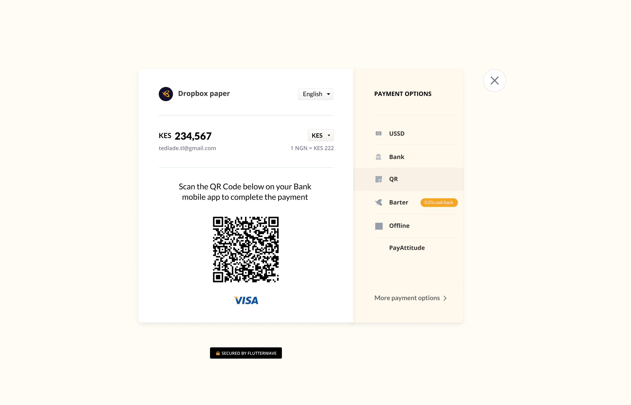
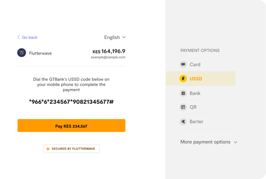
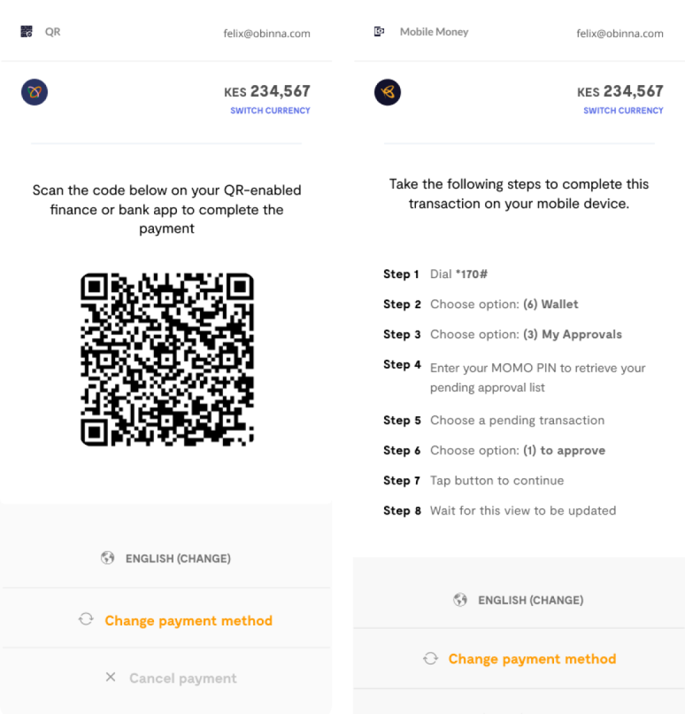
USSD. QR. Mobile Money
other components
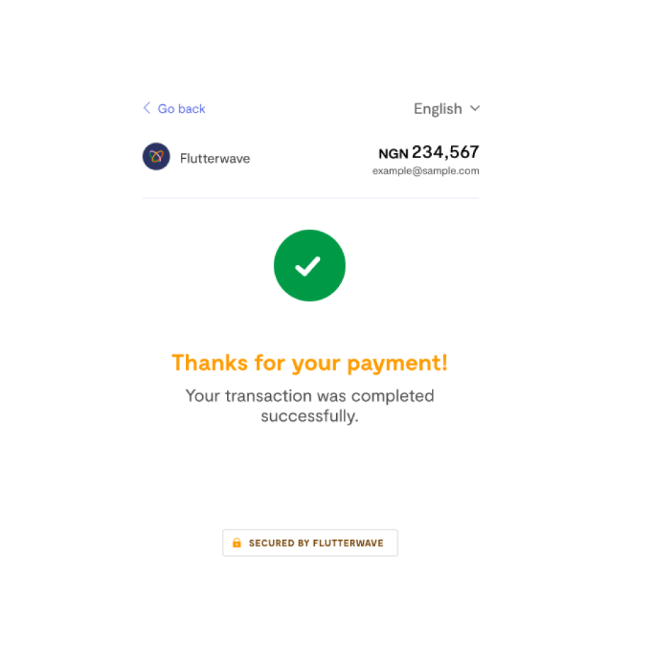
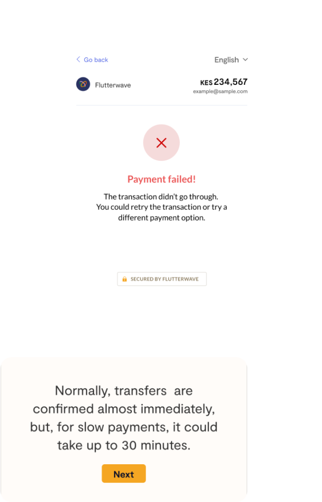
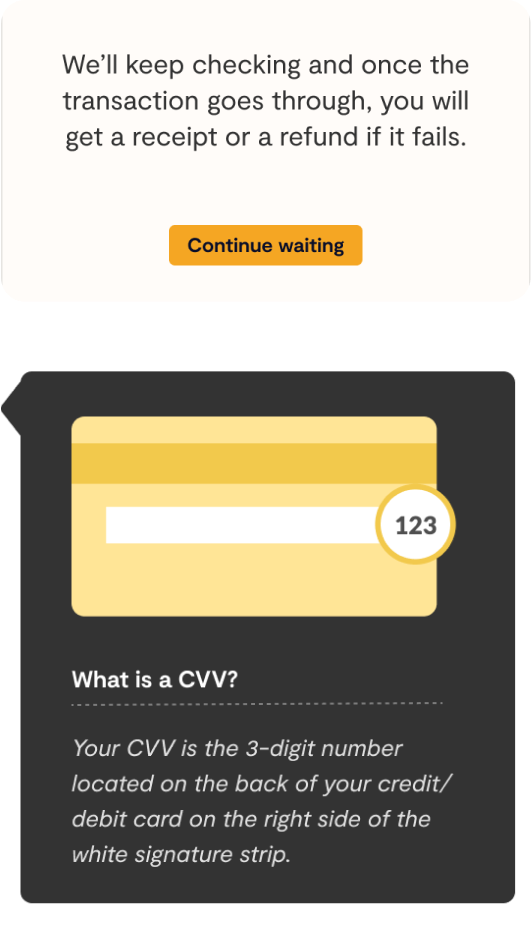
improved error messages
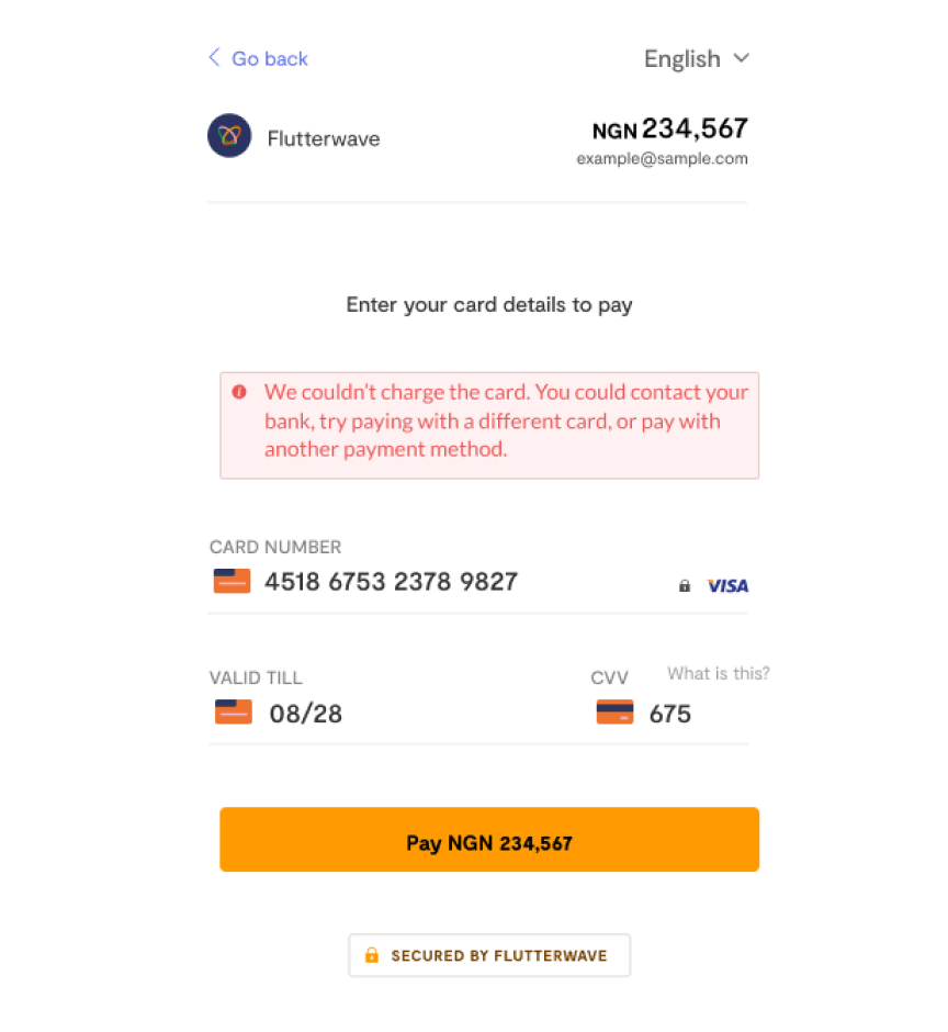
what’s next?
???
Our primary goal is to simplify payments for businesses and the individuals that pay them through Flutterwave checkout.
So whatever payment options or devices customers prefer to pay Flutterwave businesses on, we’ll make sure to deliver a smooth payment experiences to them.
